Layout
Block Layout
SurveyCompo allows you to customize the layout of blocks within a survey. You can adjust the layout of blocks to create a visually appealing and user-friendly survey. The layout of blocks can be customized using the layout* keys in the block's JSON model.
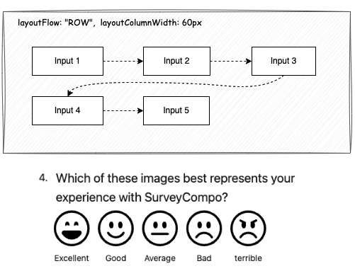
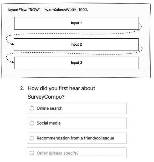
Inputs that are of the same type are grouped together and shown in a grid layout. By default, these inputs are lined up in a row, starting from the left and moving to the right. If there isn't enough space in a row for all inputs, they will continue on the next row.

However, it may appear as if the inputs are displayed in a single column. This is because all inputs have a default width of '100%'.

This default layout works well for most survey questions. You also can customize the block layout to display inputs in multiple columns.
layoutColumnCount
By default, layoutColumnCount is set to 0, which means the layout engine will try to fit as many items (columns) as possible in a row. If you set layoutColumnCount to a value greater than 0, the layout engine will arrange the inputs into the specified number of columns. If there isn't enough horizontal space, a horizontal scroll bar will appear. Therefore, using a fixed number of columns is best suited for blocks with a small number of short inputs and is not recommended if you want a responsive design.
layoutColumnWidth
Setting layoutColumnCount to 0 allows the layout engine to dynamically adjust the number of columns. If you prioritize responsiveness, you can keep layoutColumnCount at 0 and use the layoutColumnWidth key to define the width of each column. This lets the layout engine adapt the number of columns based on the available space and the specified column width.
If you want to display inputs in a given number of columns, you can also set the layoutColumnWidth to a percentage value that allows multiple columns to fit within the 100% width of the block. for example, if you want to display inputs in 2 columns, you can set the layoutColumnWidth to 50%. and if you want to display inputs in 3 columns, you can set the layoutColumnWidth to 33%. The layout engine will then automatically adjust the number of columns based on the available space, taking into account the gaps between columns.
If you set a percentage value for layoutColumnWidth that is larger than 50%, the layout engine will display the inputs in a single column.
Lastly, if you set a value for layoutColumnWidth that exceeds the available space, for example, 110%, a horizontal scroll bar will appear. This is because the layout engine tries to accommodate the specified column width, even if it exceeds the available space.
layoutColumnAutoFit
When layoutColumnCount is set to 0, the layout engine has the flexibility to adjust the column widths. By default, it will automatically optimize the column widths to fill the entire horizontal space. For instance, if you set layoutColumnWidth to 60%, the layout engine will display inputs in a single column with full width (100%) instead of the specified 60% width. To prevent this automatic adjustment, set layoutColumnAutoFit to false.
Please note that layoutColumnAutoFit is only effective when layoutColumnCount is set to 0. If you've specified a certain number of columns using layoutColumnCount, the layout engine will adhere to the specified column width, regardless of the layoutColumnAutoFit setting.
layoutFlow
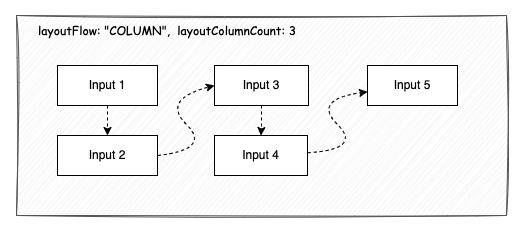
The layoutFlow key controls the direction in which the inputs are displayed within a multi-column layout. By default, layoutFlow is set to ROW, which means the inputs are arranged in a row from left to right. If you change layoutFlow to COLUMN, the inputs will be arranged in a column from top to bottom.

However, if you set layoutColumnCount to 0 and layoutFlow to COLUMN, the layout engine will display the inputs in a single column, regardless of the available space. This is because the layout engine is instructed to place each input below the previous one.
Therefore, the COLUMN layout flow is only useful when layoutColumnCount is given an explicit value.
Input layout
Input layout configuration is more straightforward compared to block layout. Two keys primarily control the layout of an input: labelPosition and labelWidth.
labelPosition determines the placement of the label relative to the input control. SurveyCompo assigns a sensible default value based on the input type. For most input types, the label is positioned at the TOP of the input control. However, for IMAGE controls, the default label position is BOTTOM.
labelWidth controls the width of the label. By default, it's set to 100%, meaning the label will occupy the full width of the input control. You can adjust this to a fixed value (like 200px) or a percentage value (like 50%). The labelWidth key is crucial for aligning inputs within a block.
The following example illustrates how labelWidth affects the alignment of inputs within a block:


{
    /* ... */
    "blocks": [
      {
        "title": "Please rate the following aspects of SurveyCompo.",
        "inputs": [
          {
            "type": "STAR_SCALE",
            "label": "Ease of Use:",
            "labelPosition": "LEFT",
            "labelWidth": "10em"
          },
          {
            "type": "STAR_SCALE",
            "label": "Value for money:",
            "labelPosition": "LEFT",
            "labelWidth": "10em"
          },
          {
            "type": "STAR_SCALE",
            "label": "Customer support:",
            "labelPosition": "LEFT",
            "labelWidth": "10em"
          }
        ]
      }
    ]
}
Tip
The Likert Matrix involves multiple inputs within a block. To adjust the width of the label for each scale in the Likert Matrix, use the block key layoutLikertMatrixLabelWidth.