Building A Survey
Welcome to the Getting Started Tutorial!
In this guide, we’ll walk you through building a Product Satisfaction Survey using SurveyCompo. This type of survey is an excellent tool for gathering valuable customer feedback to better understand their needs and preferences. Throughout the tutorial, we'll cover the essentials of creating a survey, adding conditional logic, and leveraging advanced features to customize the survey experience to your requirements.
The Product Satisfaction Survey
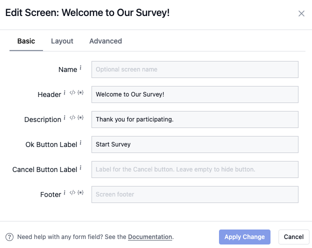
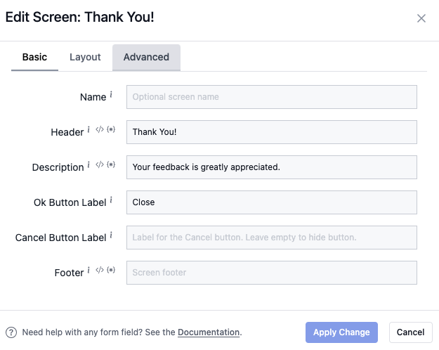
The survey starts with a welcome screen and concludes with a thank-you message. To gather demographic insights, we will ask participants about their age and preferred method of contact. Additionally, we’ll inquire about how participants learned about our product or service. The survey will assess product satisfaction using a rating scale and open-ended feedback questions. Participants under the age of 18 will be ineligible to complete the survey.
Let's review the questions that will be included in our interactive survey:
About You
- Question 1: Please enter your age.
- Question 2: What is your preferred method of contact?
- Question 3: How did you hear about us?
Product Satisfaction
- Question 4: Overall, how satisfied are you with our product?
- Question 5: What do you like most about our product? (if satisfied)
- Question 6: What could be improved about our product? (if not satisfied)
Tip
If you don’t have a SurveyCompo account yet, you can register for a free one at SurveyCompo. Once registered, log in to the SurveyCompo Portal to start creating surveys.
SurveyCompo Survey Builder
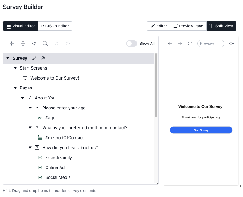
The SurveyCompo Survey Builder is a powerful tool for creating and managing surveys. Whether you prefer using the Visual Editor or working directly with JSON, our builder provides the flexibility and ease of use to suit your needs.
Key Features:
- Intuitive Visual Editor: Build surveys with a drag-and-drop interface that requires no coding skills.
- Advanced JSON Editing: Create and modify survey definitions directly in JSON using a feature-rich editor with auto-formatting, code hints, and validation.
- Real-time Preview: Instantly view your survey as it takes shape while editing the JSON code.
- Survey Templates: Jumpstart survey creation with a library of pre-made templates tailored to common use cases.
- Theme Editor: Customize the look and feel of your survey with personalized colors, fonts, and styles.
- Import/Export: Easily import JSON survey files or export your surveys for offline use.
You can easily access the Survey Builder at https://app.surveycompo.com/surveys.
The following sections of this tutorial will explore the JSON data model used to define surveys in SurveyCompo. We will focus less on the visual interface of the Survey Builder itself. While the Survey Builder offers powerful tools for creating surveys, understanding the JSON data model gives you direct control and greater flexibility in designing your survey.
Creating a New Survey
To create a new survey, click the New Survey button on the SurveyCompo App. You can start from scratch or choose from a list of pre-designed templates. For this tutorial, we will begin by creating a new survey from scratch.
A minimal survey JSON source looks like this:
The survey JSON source is a structured document that defines the survey's questions, answers, and logic. This JSON serves as the foundation for your survey and is used to build it within the Survey Builder. The name field is mandatory and is the only required key. It appears in the SurveyCompo Portal to help identify your survey.
Next, let’s add the start screen.
Adding the Start Screen
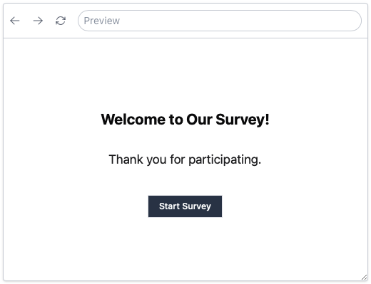
The start screen is the first thing participants see when they begin the survey, introducing them and setting the stage for the questions ahead.
Here's an example of the JSON source with a start screen:
The JSON for the start screen includes the following keys:
header: The title displayed on the welcome screen.description: The introductory message shown to participants.okButtonLabel: The text on the button participants click to begin the survey.
The startScreens key is an array that can hold multiple start screens. If there are multiple screens, one is randomly selected when the survey loads. In this example, we only have a single screen.
Info
For a comprehensive list of screen properties, refer to the Screen documentation.
Let's preview the welcome screen in the Survey Builder.
Adding the First Page
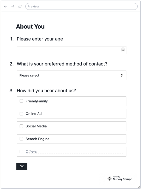
The first page of the survey will ask participants to provide their personal info. We will add a text input field for this question.
Here’s the JSON source for the first page:
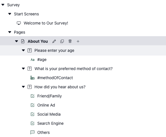
The JSON source for the first page includes the following keys:
header: The page header.blocks: An array containing three blocks, each representing a section of the page with questions or content.
Each block includes:
title: The title of the block, which serves as the question text.inputs: An array of input fields within the block.
For the 'Age' question input:
type: Specifies it as a text input field.textInputType: Indicates that it expects a number input.
For the 'Method of Contact' question input:
type: Specifies it as a dropdown input field.hint: Displays a hint within the dropdown.dropdownInputOptions: An array offering the options for the dropdown.
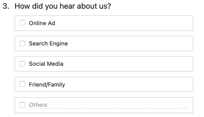
For the 'How did you hear about us?' question input:
type: Specifies it as a checkbox input field.label: Displays the label or question text for the input field.
Note that the last input field uses CHECKBOX_TEXT, which includes a text input field for additional participant information.
Tip
The values for the type and textInputType keys are case-insensitive. You can use uppercase, lowercase, or a mix of both, but for consistency, it's recommended to use UPPERCASE.
Info
The type key specifies the type of input field displayed in the survey. SurveyCompo supports various input types such as text, radio buttons, checkboxes, dropdowns, and more. For a complete list of input properties, refer to the Input documentation.
Let’s add the first page into our survey JSON source and preview it in the Survey Builder.
Adding the Second Page
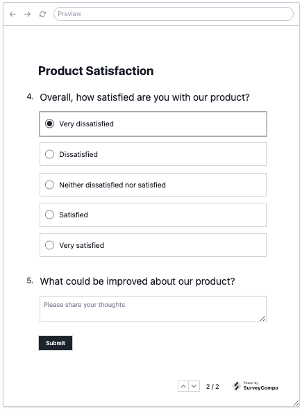
The second page of the survey will prompt participants to rate their overall satisfaction with our product.
Here's the JSON source for the second page:
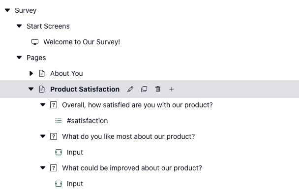
The second page of the survey includes three blocks/questions:
-
The
Overall satisfactionquestion uses an input of typeLIKERT_SCALE. Instead of specifying options directly withlikertInputOptions, SurveyCompo provides presets to simplify survey creation. In this case, we uselikertInputPresetto apply a 5-point satisfaction scale calledSATISFACTION. -
The following two questions ask participants for open-ended feedback on what they like most and what could be improved about the product. These questions use a
TEXTAREAinput field.
Info
The LIKERT_SCALE input acts similarly to a collection of RADIO inputs, making it an effective tool for gathering feedback on a scale. SurveyCompo offers several Likert scale presets such as SATISFACTION, LIKELIHOOD, and AGREEMENT to simplify survey creation. For a full list of available Likert scale presets, refer to the Likert Scale documentation.
Let’s preview the second page in the Survey Builder.
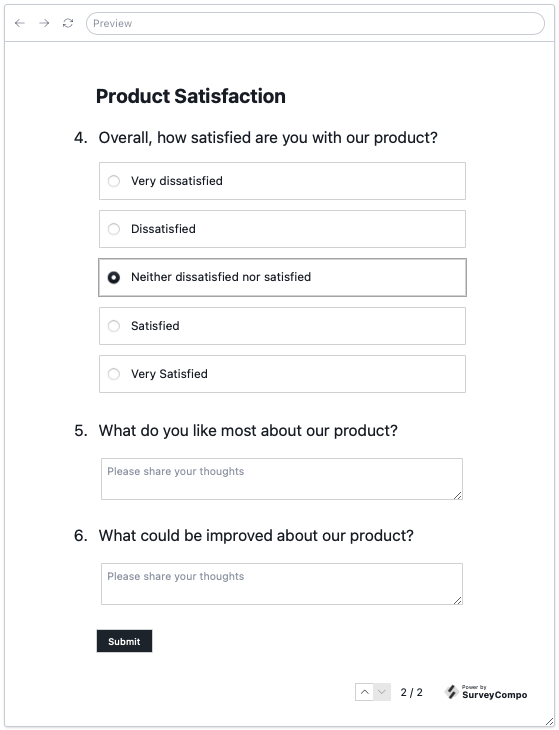
The nextButtonLabel key is set to "Submit," serving as the label on the button participants click to proceed to the next page. If left unspecified, the default label is "Next." As multiple pages are added, a navigation bar appears at the bottom of each page. This bar allows participants to navigate between pages and shows the current page number alongside the total number of pages in the survey. To hide the navigation bar, use the uiShowNavigation survey key. For more details, refer to the Survey Data Key documentation.
Adding the Completion Screen
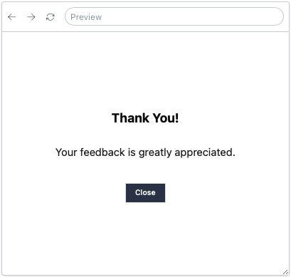
The final screen of the survey is the completion screen. It provides participants with a closing message and confirms that their responses have been recorded.
Here’s the JSON source for the completion screen:
Let's preview the complete screen in the Survey Builder.
Randomization
SurveyCompo supports randomizing questions and answer options, a valuable feature for reducing bias and providing each participant with a unique survey experience. Randomization can be applied to pages, blocks, and inputs. For more detailed guidance on implementing randomization, refer to the Randomization documentation.
In this tutorial, we will add randomization to the "How did you hear about us?" question, ensuring the input options are randomized to avoid order bias.
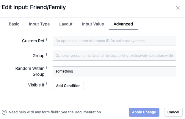
The randomWithinGroup key is a powerful feature for introducing randomization within your survey. By assigning the same randomWithinGroup string value to a group of inputs, you can shuffle their order while keeping other questions in sequence.
In our example, all inputs except the final "Others" option are grouped for randomization. This ensures that the "Others" input consistently appears at the end of the list, regardless of the randomization applied to the preceding inputs.
It's important to note that randomization occurs when the survey loads and remains consistent throughout the survey session. To view the effects of randomization, simply refresh the page.
Let’s preview the randomization in the Survey Builder:
Disqualification
SurveyCompo supports disqualification logic to exclude participants who do not meet specific criteria. This feature ensures that only eligible participants complete the survey. You can disqualify participants based on their inputs and variables. For detailed instructions on implementing disqualification logic, refer to the Disqualification documentation.
In this tutorial, we will integrate disqualification logic into the survey to exclude participants under the age of 18. The disqualification logic will be applied to the "Age" input and an Abort Screen.
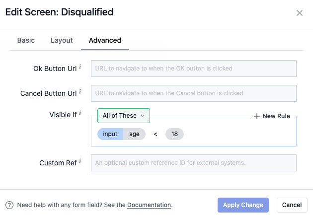
The "Age" input is assigned an id key to uniquely identify it within the survey. This id is essential for referencing the input in disqualification logic. The disqualification condition is defined using the visibleIf key in the Abort Screen. In this case, participants are disqualified if the value of the "Age" input is less than 18.
SurveyCompo supports multiple abort screens, allowing you to create customized disqualification messages for different scenarios. When the disqualification condition is met, the appropriate abort screen is displayed, ensuring participants understand why they are excluded from completing the survey.
Info
The visibleIf key allows you to implement powerful conditional logic in your survey. By referencing input values and external variables, you can dynamically control the visibility of pages, screens, blocks, and inputs based on participant responses. For more details, refer to the Conditional Logic documentation.
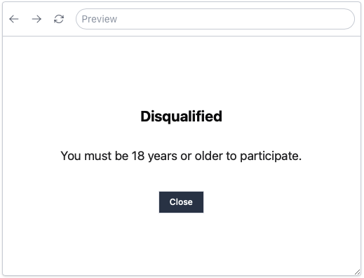
Let’s preview the disqualification logic in the Survey Builder:
Piping
SurveyCompo supports piping, allowing you to personalize survey questions and responses based on participant inputs. This feature enables the creation of dynamic surveys that adapt to individual participants by inserting input values and external variables into the survey content. For detailed instructions on implementing piping, refer to the Piping documentation.
In this tutorial, we will incorporate piping to personalize the "Disqualified Screen" with the participant's age.
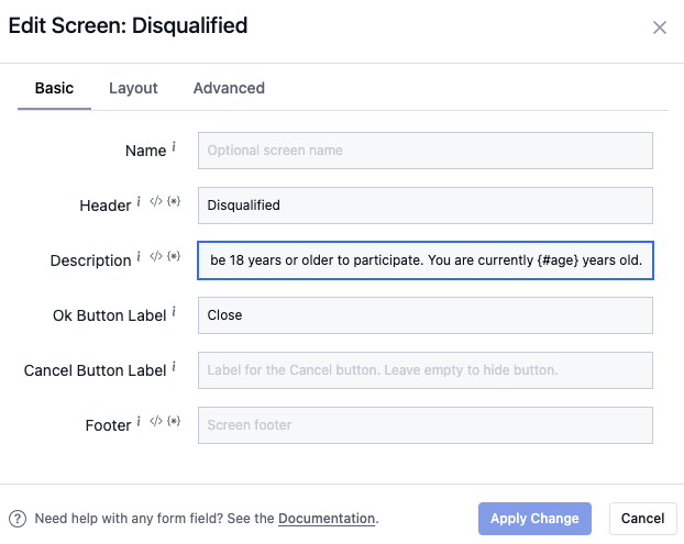
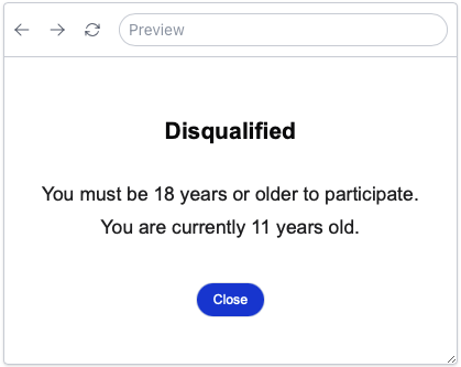
The description key of the Abort Screen includes the {#age} placeholder, which dynamically references the value of the "Age" input using its unique identifier, age. When a participant is disqualified, this placeholder is replaced with the participant's actual age. Piping functionality enhances survey personalization by delivering relevant information based on participant responses.
Let’s preview the piping feature in the Survey Builder by entering an age value of 11 to observe the personalized message:
Validation
SurveyCompo supports input validation to enhance data accuracy and minimize errors in survey responses. This feature ensures that participants provide valid and complete information based on specified criteria such as input type, format, and value. For detailed instructions on implementing validation, refer to the Validation documentation.
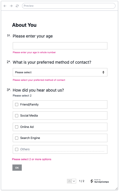
In this tutorial, we will guide you through the process of setting up validation rules to improve your survey. You’ll configure the "Age" input to accept only numerical entries within the 0–100 range. Additionally, you'll make the "Method of Contact" question mandatory and require participants to select at least two options for the "How did you hear about us?" question.
The updated JSON source will include the following validation rules:
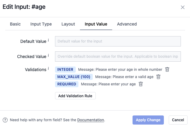
The "Age" input incorporates three essential validation rules:
INTEGER: Ensures the input value is an integer.MAX_VALUE: Specifies the maximum permissible value for the input.REQUIRED: Makes the input mandatory.
For the "Method of Contact" question, a REQUIRED validation rule ensures participants select a preferred contact method.
In the "How did you hear about us?" block, a MIN_SELECTION validation rule enforces a minimum selection of two options.
When a block includes a "required" validation rule, SurveyCompo automatically appends an asterisk (*) after the block index number to indicate its mandatory status.
Note
Setting textInputType to NUMBER for the "Age" input enhances the user interface by enabling features like a number keyboard and stepper. However, this setting alone does not enforce numerical validation. To ensure correct input format and value range, it’s essential to apply the INTEGER validation rule. For comprehensive details on input types and their associated validation rules, refer to the Validation documentation.
Let’s explore how these validation rules work within the Survey Builder:
Conditional Logic
SurveyCompo supports conditional logic, allowing you to dynamically show or hide specific pages, blocks, and inputs based on participant responses or external variables. This feature personalizes the survey experience, ensuring participants receive relevant questions based on their previous answers. For detailed guidance on implementing conditional logic, refer to the Conditional Logic documentation.
In this tutorial, we will integrate conditional logic into the survey. Based on the participant's response to the "Overall satisfaction" question, we will adjust the survey flow:
- If a participant expresses dissatisfaction, we will prompt them for additional feedback on potential product improvements.
- If a participant is satisfied, we will ask them to share what they appreciate most about the product.
Below is the updated JSON source code for the second page of the survey:
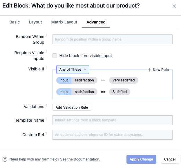
We assign an id (satisfaction) to the "How satisfied are you?" input. This id is then used to define the visibleIf conditional logic, a powerful tool for creating dynamic survey experiences. By referencing input values or external variables, you can dynamically show or hide pages, screens, blocks, and inputs based on participant responses.
SurveyCompo uses Condition Expressions to define visibility conditions. In this case, we use the $or operator to display the "What do you like most about our product?" block if the participant selects "Very satisfied" or "Satisfied" on the "Overall satisfaction" question. Conversely, selecting "Very dissatisfied" or "Dissatisfied" will display the "What could be improved about our product?" block. If the participant selects "Neither dissatisfied nor satisfied," follow-up questions are hidden.
Condition Expressions support a variety of operators such as $and, $or, $not, >=, <=, ==, !=, >, and <. For a full list of operators and their usage, refer to the Conditional Logic documentation.
For an optimal user experience, consider placing conditional blocks on separate pages. However, for this tutorial, we will keep them on the same page to demonstrate how conditional logic dynamically controls block visibility based on participant responses.
Let’s preview the conditional logic in the Survey Builder:
Customization with Theme
In this tutorial, we customize the survey theme to use a custom color palette and default radius for buttons, boxes, and inputs. Additionally, we change the font family to Arial.
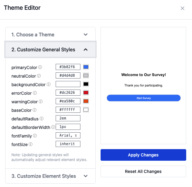
By default, SurveyCompo generates a color palette based on the primaryColor provided. These colors are applied to buttons, boxes, and inputs throughout the survey. The fontFamily key sets the font family for all text elements, while the defaultRadius key defines the default corner radius for buttons, boxes, and inputs. If not specified, textareaRadius will use the value from defaultRadius for textarea inputs.
Preview the customization in the Survey Builder:
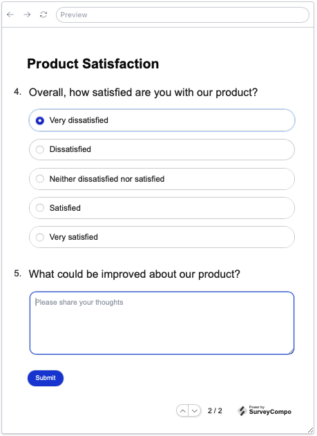
SurveyCompo offers extensive customization options beyond themes. You can customize surveys using custom CSS, HTML text, and various layout options to ensure they align with your brand and effectively engage your audience. For comprehensive details on customization options, refer to the Customization section of our documentation.
HTML Text
SurveyCompo supports HTML text within surveys to enhance the visual appeal and readability of your questions and descriptions. HTML text allows you to format content, add images, and embed videos. For more information on using HTML text, refer to the HTML Text documentation.
In this tutorial, we’ll incorporate HTML text into the page footer to include a link to the privacy policy.
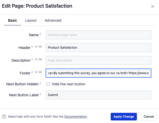
The htmlFooter key allows you to incorporate HTML text into the footer of the page. This feature supports HTML tags for formatting text, adding links, and embedding media. In the following example, we use an anchor tag to create a hyperlink to the privacy policy.

However, a common issue is that the link in the footer may not appear as a standard hyperlink. Typically, hyperlinks are distinguished by a different color and often underlined for clarity.
SurveyCompo does not apply default styles to custom HTML elements. To improve the appearance of the hyperlink, you can use inline styles or CSS customization.
We assign the class name my-link to the hyperlink within the htmlFooter key. Next, we define the CSS class my-link in the css key to specify the hyperlink's color and text decoration. This customization allows us to enhance the appearance of the hyperlink.
Preview the customized hyperlink in the Survey Builder:
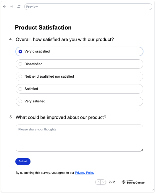
The use of HTML text extends to various elements within the survey, including Screens, Pages, and Blocks. For more details on incorporating HTML text, refer to the HTML Text documentation.
Using Templates
We recently added an HTML footer to the final page of our survey. However, if we want this footer to appear on every page, manually duplicating the HTML across each page can be time-consuming and prone to errors. Fortunately, SurveyCompo offers a solution: templates. Templates are reusable components designed to define common elements like headers, footers, and styles, allowing you to apply them consistently throughout your survey. For detailed instructions on using templates, refer to the Templates documentation.
In this tutorial, we’ll create a template specifically for the HTML footer and apply it universally across all pages of the survey.
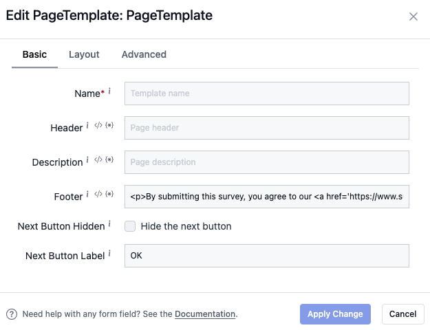
We’ve successfully created a page template named pageWithFooter that incorporates an HTML footer. This template has been applied to both survey pages, ensuring consistency across the survey. You also have the flexibility to override template properties on specific pages as needed.
When previewed in the Survey Builder, the HTML footer will be consistently visible on both pages where the pageWithFooter template is applied.
Adding Input Identifiers
As we finalize the survey’s appearance, it’s crucial to ensure its functionality. SurveyCompo records respondents’ inputs and selections for each survey item. For example, if a respondent enters "18" for the age input, the expected data format would be {input: 'age', value: 18}. Therefore, assigning identifiers to each input in the survey is essential.
These identifiers are also used for referencing inputs in conditional logic, validation rules, and data piping. We’ve already introduced the id key to the "Age" input on the survey’s first page to implement disqualification logic. The id ensures that the input’s values are accurately captured upon survey completion. Without this identifier, determining which input corresponds to which value would be challenging.
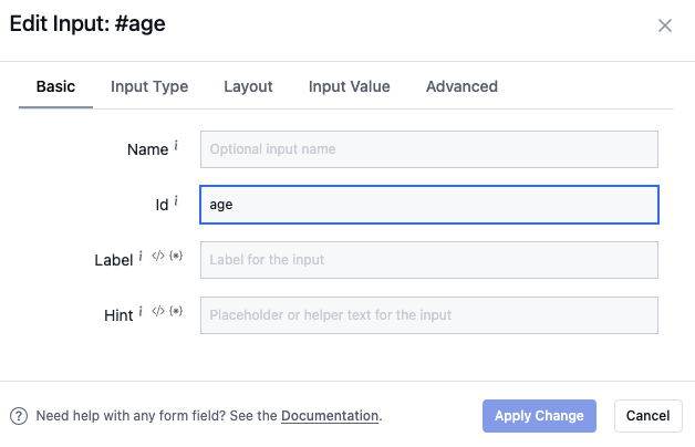
SurveyCompo supports several optional input identifiers:
id: An optional identifier for the input, used for referencing in conditional logic, validation rules, and piping.name: A descriptive name for the input, primarily for human reference. Ifidis not provided,nameis used to generate anidvalue.customRef: An optional custom reference for the input, useful for referencing in external systems.
Let’s proceed by adding identifiers to the inputs in our survey:
Identifiers can also be assigned to blocks and pages. These identifiers will be accessible within SurveyCompo events. Events are triggered when participants interact with the survey, providing valuable insights into their behavior and responses. This is also how survey data is collected and analyzed. For more details on survey events, refer to the Events documentation.
What's Next?
Congratulations on successfully creating a survey in SurveyCompo using the JSON data model! You’ve learned how to define survey questions, answers, logic, and customization options. Additionally, you’ve explored advanced features such as randomization, disqualification, validation, conditional logic, and HTML text. Mastering these concepts will help you build engaging and interactive surveys that generate valuable insights.
Feel free to preview the survey and explore its corresponding source code on GitHub.
In the next part of the tutorial, we’ll cover distributing your survey, collecting responses, and analyzing results. We’ll also explore advanced topics including survey events, webhooks, and integrations. Stay tuned for more exciting content!
